
Dark Patterns in Design
Take a moment to think about a really awesome experience you had when using an app or website. Hopefully that was easy; even if it wasn’t, I feel confident that this next exercise will be. Can you think of a website or app that was dissatisfying, frustrating, or intrusive to use? What caused that experience? Was it the result of the website or app’s design? As a human interface designer, these are questions that keep me up at night.
Goals of interface design.
Interface design is the art and science of creating a place where people can intuitively get things done. In a commercial context, the interface must also draw attention to a company’s strengths and facilitate revenue. While pursuing these goals, it’s important to keep ethics in mind, much as physicians take the Hippocratic Oath — first, do no harm.
Dark patterns.
When ethics are not a deliberate part of the design process, dark patterns can emerge. Dark patterns are interface design choices intended to trick the user, often into spending more money or giving up unnecessary personal information. Sometimes, dark patterns are the result of deliberate action by the designer; other times, they are mandated by a designer’s employer because they appear to generate greater revenue. Design choices are ethical choices and can clearly signal a company’s intent — are they trying to help you do great things, or are they trying to take advantage of you to make a quick buck? When companies try to trick their users, the backlash can be immediate and long-lasting.
What do dark patterns look like?
Dark patterns appear in many shapes, and are unified by using deception to accomplish business goals. For instance, any interface that encourages you to make a mistake to promote a business’s interests is a dark pattern — an advertisement disguised as content on a webpage, a checkbox that must be checked in order to not receive a newsletter. They exist in the brick-and-mortar world as well: hidden charges on phone bills, aisles laid out to confuse shoppers and keep them in-store, and super-limited inventory on sale items used to get people in the door, to name a few.
Case Study: Parallels
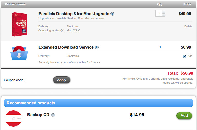
An example of obvious dark pattern usage comes courteous of Parallels, the popular virtualization software. With every purchase of Parallels 8, they added something to your shopping cart without telling you: an Extended Download service ($6.99) that allowed you to re-download the software for free. Not only did they add something to your cart without asking: the service itself was entirely redundant, because the software was already a free download from their website. In addition to this tricky bundling, the shopping cart prominently recommended buying a backup CD ($14.95) of the software — the same software that could always be downloaded free from their website. Perhaps this CD would be useful for those without reliable internet access, but its existence seems more like a cynical ploy to exploit people’s natural aversion to loss.
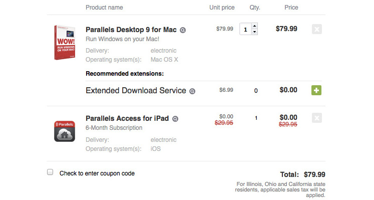
After a tidal wave of criticism (and likely, lost sales) from their customers, Parallels backpedaled on their use of dark patterns. Parallels 9, the next iteration of their product, did not sneakily add anything to the shopping cart without asking — but still recommends the useless Extended Download Service. This is clearly less of a trick, but they’re still trying to charge money for a product with no merits.
Obvious dark patterns become easy to spot once you start to look for them. Let’s look at a more subtle example: a series of interface changes made by Google to Gmail, their popular email product.
Case Study: Gmail
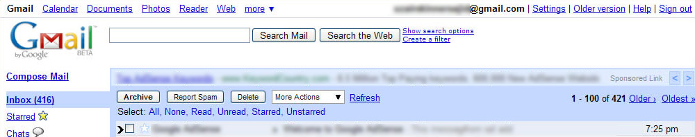
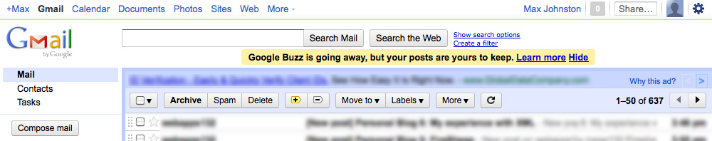
From the time of its launch until late 2010 or early 2011, Gmail stuck with a fairly consistent interface. In the top right it displayed your email address, access to settings, and a link to sign out in the prominent corner position.
In their first big change (late 2010 or early 2011), Google chose to hide the sign out button in a menu — you could get there by clicking on your name. Because Google gathers individualized data about user habits, making it harder for users to sign out is advantageous.
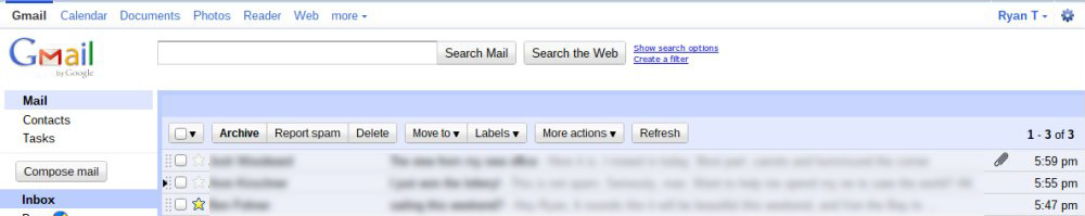
The next significant change came midway through 2011 when Google launched Google+, their social media platform. The prominent top right corner (and top left corner) was taken over by Google+, with an interface to share and receive notifications. Not particularly devious, but it provides insight into their priorities.
In their most recent significant change (sometime in 2013), Google takes advantage of how we expect things to work. We know from their previous redesign that they want us to interact with Google+, and now they force the issue. When you click on your name — which is in the same position it has been — you are taken directly to your Google+ page. The menu to sign out has been hidden somewhere new and unexpected, beneath the tiny photo in the corner.
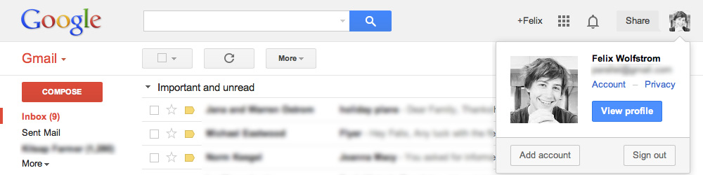
The changes to Gmail throughout the years may seem harmless compared to the extreme dark patterns that can be encountered elsewhere. Still, Google established an expectation of how their product worked (how to sign out of Gmail) and changed it for their own advantage. When I experienced this change, I felt tricked — they’d exploited my expectations to push me into Google+. Google offers a number of valuable products, but by tricking me they have undermined my trust in their company. As a result, I use their services less and am unlikely to recommend them to others.
Further, more egregious examples abound: free services that collect credit card information and automatically enroll you in a paid premium service unless you cancel (some don't even provide a reminder before renewal), hidden costs only revealed at the final stage of checkout — the list of deceptive and unethical practices is a long one.
Using design for good.
Of course, interface design is not a series of black and white choices. There is plenty of moral grey area — such as using the default state of an interface to your advantage. These might be checkboxes that appear when signing up for a service that give permission to share your personal information or send you newsletters. While you’re not necessarily being tricked, companies who ask you to opt-out rather than opt-in are taking advantage of our natural inclination towards the path of least resistance.
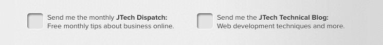
We don’t ask people to opt-out at JTech — although we’re optimistic that people will find this web development blog and our newsletter interesting, we don’t make that assumption on your behalf. You won’t find any boxes already checked when you decide to get in touch with us. Instead of taking advantage of human psychology and expectations to trick people, we can use that same knowledge to create designs for advanced websites that are intuitive, friendly, and help people enjoy their experience.
Deception and its fallout.
The temptation to take advantage of the people using your website or app is obvious: companies do so because it tests well; more people will sign up for a recurring account, buy insurance packages, or sign up for your newsletter when deceived. It makes money. Because dark patterns can be profitable, it may seem naïve to believe that we should be working to help people with their goals instead of our client business’s immediate interests. However, using dark patterns can immediately drive people away — leading them to close your website in frustration, write a negative review of your business, or share their experience on Twitter.
At JTech we believe that web design should follow the same ethics you live by in the rest of your life. It may seem as though a small deception is a harmless shortcut to profit – this is simply not the case. Customers and visitors who feel tricked are more likely to turn to a competitor’s service or product. In the long run, using dark patterns also ignores the advantages of treating people well: building trust and credibility for your company and growth from a good reputation and well-designed product. When you lose a customers’ trust, they will no longer give your company the benefit of the doubt. Not only may you lose your customers’ business: they are likely to actively avoid your company’s offerings in the future and recommend that their acquaintances also steer clear.
Be aware of how your company is interacting with its customers — is it an honest, helpful interaction, or is it based in deception? Deceiving and blatantly monetizing your customers signals bad intentions and can ultimately cripple your credibility and success.
Goals of interface design.
Interface design is the art and science of creating a place where people can intuitively get things done. In a commercial context, the interface must also draw attention to a company’s strengths and facilitate revenue. While pursuing these goals, it’s important to keep ethics in mind, much as physicians take the Hippocratic Oath — first, do no harm.
Dark patterns.
When ethics are not a deliberate part of the design process, dark patterns can emerge. Dark patterns are interface design choices intended to trick the user, often into spending more money or giving up unnecessary personal information. Sometimes, dark patterns are the result of deliberate action by the designer; other times, they are mandated by a designer’s employer because they appear to generate greater revenue. Design choices are ethical choices and can clearly signal a company’s intent — are they trying to help you do great things, or are they trying to take advantage of you to make a quick buck? When companies try to trick their users, the backlash can be immediate and long-lasting.
What do dark patterns look like?
Dark patterns appear in many shapes, and are unified by using deception to accomplish business goals. For instance, any interface that encourages you to make a mistake to promote a business’s interests is a dark pattern — an advertisement disguised as content on a webpage, a checkbox that must be checked in order to not receive a newsletter. They exist in the brick-and-mortar world as well: hidden charges on phone bills, aisles laid out to confuse shoppers and keep them in-store, and super-limited inventory on sale items used to get people in the door, to name a few.
Case Study: Parallels
An example of obvious dark pattern usage comes courteous of Parallels, the popular virtualization software. With every purchase of Parallels 8, they added something to your shopping cart without telling you: an Extended Download service ($6.99) that allowed you to re-download the software for free. Not only did they add something to your cart without asking: the service itself was entirely redundant, because the software was already a free download from their website. In addition to this tricky bundling, the shopping cart prominently recommended buying a backup CD ($14.95) of the software — the same software that could always be downloaded free from their website. Perhaps this CD would be useful for those without reliable internet access, but its existence seems more like a cynical ploy to exploit people’s natural aversion to loss.
After a tidal wave of criticism (and likely, lost sales) from their customers, Parallels backpedaled on their use of dark patterns. Parallels 9, the next iteration of their product, did not sneakily add anything to the shopping cart without asking — but still recommends the useless Extended Download Service. This is clearly less of a trick, but they’re still trying to charge money for a product with no merits.
Obvious dark patterns become easy to spot once you start to look for them. Let’s look at a more subtle example: a series of interface changes made by Google to Gmail, their popular email product.
Case Study: Gmail
From the time of its launch until late 2010 or early 2011, Gmail stuck with a fairly consistent interface. In the top right it displayed your email address, access to settings, and a link to sign out in the prominent corner position.
In their first big change (late 2010 or early 2011), Google chose to hide the sign out button in a menu — you could get there by clicking on your name. Because Google gathers individualized data about user habits, making it harder for users to sign out is advantageous.
The next significant change came midway through 2011 when Google launched Google+, their social media platform. The prominent top right corner (and top left corner) was taken over by Google+, with an interface to share and receive notifications. Not particularly devious, but it provides insight into their priorities.
In their most recent significant change (sometime in 2013), Google takes advantage of how we expect things to work. We know from their previous redesign that they want us to interact with Google+, and now they force the issue. When you click on your name — which is in the same position it has been — you are taken directly to your Google+ page. The menu to sign out has been hidden somewhere new and unexpected, beneath the tiny photo in the corner.
The changes to Gmail throughout the years may seem harmless compared to the extreme dark patterns that can be encountered elsewhere. Still, Google established an expectation of how their product worked (how to sign out of Gmail) and changed it for their own advantage. When I experienced this change, I felt tricked — they’d exploited my expectations to push me into Google+. Google offers a number of valuable products, but by tricking me they have undermined my trust in their company. As a result, I use their services less and am unlikely to recommend them to others.
Further, more egregious examples abound: free services that collect credit card information and automatically enroll you in a paid premium service unless you cancel (some don't even provide a reminder before renewal), hidden costs only revealed at the final stage of checkout — the list of deceptive and unethical practices is a long one.
Using design for good.
Of course, interface design is not a series of black and white choices. There is plenty of moral grey area — such as using the default state of an interface to your advantage. These might be checkboxes that appear when signing up for a service that give permission to share your personal information or send you newsletters. While you’re not necessarily being tricked, companies who ask you to opt-out rather than opt-in are taking advantage of our natural inclination towards the path of least resistance.
We don’t ask people to opt-out at JTech — although we’re optimistic that people will find this web development blog and our newsletter interesting, we don’t make that assumption on your behalf. You won’t find any boxes already checked when you decide to get in touch with us. Instead of taking advantage of human psychology and expectations to trick people, we can use that same knowledge to create designs for advanced websites that are intuitive, friendly, and help people enjoy their experience.
Deception and its fallout.
The temptation to take advantage of the people using your website or app is obvious: companies do so because it tests well; more people will sign up for a recurring account, buy insurance packages, or sign up for your newsletter when deceived. It makes money. Because dark patterns can be profitable, it may seem naïve to believe that we should be working to help people with their goals instead of our client business’s immediate interests. However, using dark patterns can immediately drive people away — leading them to close your website in frustration, write a negative review of your business, or share their experience on Twitter.
At JTech we believe that web design should follow the same ethics you live by in the rest of your life. It may seem as though a small deception is a harmless shortcut to profit – this is simply not the case. Customers and visitors who feel tricked are more likely to turn to a competitor’s service or product. In the long run, using dark patterns also ignores the advantages of treating people well: building trust and credibility for your company and growth from a good reputation and well-designed product. When you lose a customers’ trust, they will no longer give your company the benefit of the doubt. Not only may you lose your customers’ business: they are likely to actively avoid your company’s offerings in the future and recommend that their acquaintances also steer clear.
Be aware of how your company is interacting with its customers — is it an honest, helpful interaction, or is it based in deception? Deceiving and blatantly monetizing your customers signals bad intentions and can ultimately cripple your credibility and success.

About Felix Wolfstrom
Felix Wolfstrom has 13+ years of experience in human interface design. He currently serves as JTech’s Senior Designer. Felix’s experienced approach to web design guides every website JTech creates. He focuses on useable, meaningful design that doesn’t compromise on aesthetic value.
More articles by Felix: Dark Patterns in Design | 17 UI Tips for Designing Mobile-Friendly Websites | JTech Brand Evolution